
Forget mobile, go responsive?
I recently attended DrupalCamp Austin and went to several sessions on mobile. It was a little funny how they contradicted each other. One session would talk about how mobile is the way to go then another session would talk about going responsive. I've been on the fence on which I think is the right approach. I've done lots of mobile sites, but I hadn't jumped into the responsive world yet. So for a recent project, I decided to give it a try.
First off, what do I mean?
By mobile, I'm talking about creating a site with a different HTML/CSS markup but serving the same content. When I do mobile, I generally use a tool to determine if the user is on a mobile device and then I serve the different content designed for the mobile device.
When I talk about responsive, I'm talking about using CSS media queries to ask the browser what it can do and then serve the same content and let CSS techniques change what the user sees. (More about Responsive Web Design.)
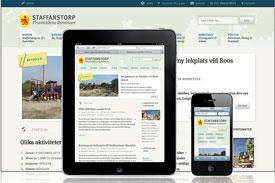
If you've ever been unable to see an entire website because your browser or screen is too small, you know how frustrating it is to have to scroll around. Responsive elminates that issue by dynamically resizing the website—no matter the screen size. Try it with the DrupalCamp Austin (built by the great people at Four Kitchens) site; no matter how small or large you make your browser, you can always see everything.
Why responsive?
The number of browsers, devices are increasing every day. Gone are the days of checking IE, Firefox and Safari; now there are cell phones, tablets, and desktops, and the future is wide open to more that we haven't dreamed yet. Responsive is about "future-proofing" the website so it is as ready as possible for whatever the future holds. The thing I love most about responsive is that I'm serving the same content to everyone.
My questions (and few answers) on the responsive trend
Thoughts:
- I love the aspect that much of my testing simply involves making the browser more narrow to see what happens to the design at various screen widths.
- I love that I'm at least trying to be "future-proof."
- I appreciate that I'm serving the full content to everyone. I always question the usefullness of a stripped-down mobile site. (Note: I do still see a valid use-case for mobile when the user needs to interact with data and perform a task — a specialized interface is great for this.)
Questions:
- If there isn't one design for the page, how do I get design approval from the client? In the responsive world, there isn't one pixel-perfect design. Instead it is a process of progressive enhancement. This means that I start with the lowest common output and "enhance" my design as the screen and browser capability increases. What do I get the client to approve? How can this be explained to a client?
- It feels like you are developing 4 or 5 different sites. I know that I can develop a base and just customize the smaller pieces, but I'd love to learn some best practices on this.
- Is it ok to occasionally use pixel-sizing or does everything need to be ems and %s?
I would love to hear other thoughts on this topic. What do you think is good or bad about responsive?
More
- HTML5 Base Starter Themes in Drupal 7 (Also outlines some responsive themes.)
[Image Credit: Axbom]
MONTHLY MARKETING INSIGHTS.
Get thought-provoking and actionable insights to improve how your firm makes a connection with your customers.


LEAVE A COMMENT
What if the client side wants to see the full version (Desktop Version) site. How to switch between mobile verison media-query to Desktop version media-query?
Hi there, great write-up and thanks for coming to DrupalCamp Austin!
Just for the record, when I said "forget mobile, go responsive," I was talking about websites that are known to have very diverse audiences. So the various talks presented at DCATX were not in disagreement IMO.
Building a dedicated mobile app is a great idea in many situations. There were other great talks at DCATX about dedicated apps, and for good reason: there are times when a dedicated app is the only option. For example, the web API for cameras is not finalized just yet, so you have to go with a more native solution, even if it's PhoneGap or similar. In fact, Jeff Linwood's presentation covered this exact use case, which is not yet possible in plain mobile browsers.
However, I feel responsive websites are far more effective for general-purpose sites, allowing you to bundle the functionality together and serve multiple devices all at once.
@Vikky, the beauty of responsive the different versions isn't really an issue any longer. That is always a problem with mobile. With responsive, the display changes depending on how wide your screen is. If you have your browser squeezed down to really narrow, it will show what the mobile device will see. If you maximize your window, it shows the full site.
I hear http://www.modernizr.com/ is good to help you manage this. On the Drupal side of things, I'm using Adaptive Theme. http://drupal.org/project/adaptivetheme
@Chris, I feel like a celebrity responded to my blog post :) I totally knew what you meant, it was funny how the previous session had just said something opposite. Everyone I talked to understood what everyone meant.
We also talked a lot more about when mobile is right and could list several use cases for native mobile ... we also thought of several situations where just a mobile site could be good for a very focused website (flight tracking, etc).
Overall, I think responsive is going to be my starting point going forward. (I was on the fence and you pushed me off :)
Your session was great! I especially appreciated how the DCATX site itself was responsive.
@jd How can you change your screen size on a mobile device? All I am asking what is the best way to switch between mobile version to Desktop version, if required.
I don't think there's necessarily a conflict between responsive design and mobile apps - I think there's actually a more interesting discussion around responsive design and mobile UI toolkits like jQuery Mobile, Sensa Touch, and Toura Mobile.
You can certainly have a responsive Drupal site within a mobile app that you wrap in PhoneGap, or in a web browser control inside a native app.
There isn't really a one-size fits all solution to any mobile scenario, because everybody has different problems, audiences, and budgets - what Drupal gives you is several different ways to build a mobile strategy with a CMS backend.
Offline access might be essential for some apps, others might need access to the camera for uploading videos. Or you might just want to sell your app through the App Store or Android Market.
Oh @Vikky ... now I see the issue you raise. That is a great point!
I wonder if I can just allow zooming and let them pinch-zoom the screen back out.
Thank you for bringing this issue up ... if I'm on a phone and want to see the desktop version ... how can I do it.
I'd love to hear if anyone has figured this out.
We did just chat here about it and agreed that usually almost all the content is there ... but I can think of times when I may hide a rotator or other types of content on the mobile device ... how can they get back to it?
Yes, exactly. There is however a probable solution.
Step 1. Create a subdomain m.example.com
Step 2. Point the subdomain to share the same database and/or javascript files.
Step 3. Create a new fixed width css and put that into the theme folder of new sub site.
@Vikky @jd
I haven't tried this and don't know if its the best method but here's my idea for showing the "full" design on a mobile device using responsive techniques:
The body element would have a css style applied called 'responsive' and every time you apply a css media query you'd include .responsive in the CSS selector.
At the bottom of the page you'd have a link "Display desktop version" but it'd be hidden using CSS. As the page shrinks you'd display this link using CSS media queries. Clicking the link would fire some javascript code that removes the .responsive style from the body element which would turn off all the media queries putting the site back to it's full page design.
As a content creator, I am a big fan of drupal. In August we did a complete redesign including new content creation of our IT website at EKU. This past week, responsive. The goal of the redesign-clear, correct content. The goal of going responsive-allowing our users (students, faculty & staff) the ability to find IT support on any device. it.eku.edu
@JD & @Vikky
You can switch off the responsive component in the theme UI and it will become a standard non-responsive theme, thereby showing the fixed width version even in mobile. Then simply log back in and set it to be responsive again.
I think Adaptive theme has this setting as well, but I can't confirm as I don't have Adaptive installed on my machine at the moment, but you can certainly do this with Omega.
JK
It would be great if you did a post talking about the process you took to complete your recent project that you did as a responsive design.
@Vikky There is no practical (and certainly no consistent across all devices way) to enable a user with a device of a specific size to see the 'version' intended for another.
Media queries operate in a boolean manner. Either the screen size matches the media query or it doesn't, and screen sizes will only change on re-orientation (and that's not even guaranteed as many browsers now compensate and auto-zoom the viewport).
Most Android devices however do enable users to switch their viewport size...which can have the same effect as changing the screen size. This is accomplished using the Zoom Levels setting in (the browser) Settings. For example, setting the zoom level to 'Close' resets the viewport to 240px, even if the devices is 800px wide. So if you have a major media query breakpoint at that level, those changes will be reflected as if the user had chosen a new version of the site.
This is both a blessing and a curse however. It does enable users to control their experience to a certain extent however often causes loading of additional images and scripts, and causes page reflows (though not always page refreshes, which is a big problem as the old layout/styles/scritps can class with the new ones that are being loaded). All of these affect performance and overall user experience.
As for me, I have never used a responsive theme but I think this is the best approach if you start a project with a mobile version in mind. If you already have an existing website and want to add mobile version for it, you may use theme switching option.
What do you think?