

Don't Build Things Differently. Build Different Things.
You don’t need Millennials to tell you that mobile sites matter. Mobile usage is slowly taking over desktop, and there are no signs of slowing down. Just this year, we saw the scales significantly tip towards mobile, taking 51% of the digital media time pie, compared to a 42% share for desktop. Some best practices from desktop web design carry over to mobile principles, but it would be a mistake to treat them as the same animal. As Will Critchlow, founder and CEO of Distilled, said, “Don’t build things differently; build different things.”
 Stop Trying to Fit Mobile into a Desktop Box
Mobile site design shouldn’t be an afterthought anymore, and many developers even argue that you should start designing for mobile first. It’s a different experience than desktop, and people use each platform for different things. When you’re trying to find the hours of operation for a local restaurant on your phone, you may give up and go somewhere else if you can’t easily find them. Perhaps the hours are embedded in a paragraph on a less-obvious page, easier spotted on the desktop version of the site. This matters more than annoying a user; you might just be missing out on a potential sale.
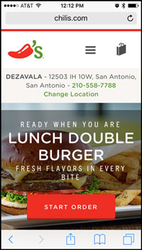
4 Mobile Musts
- Simple, simple, simple. Keep your content clear and focused. Users won’t take the time to search for what they’re looking for on your mobile site; they’ll go somewhere else. Navigation menus should be easy to spot and manageable in size, and for the life of me, do not make users scroll to see the whole menu.
- Function over form. Performance is king on mobile. Your visitors will appreciate a site that runs fast (see earlier about winning an argument). This isn’t the place for impressive, detailed graphics that take ages to load.
- Less is more. Less copy, images, and form fields. We’re talking bare essentials. Your site should feel more like a basic outline than a detailed term paper.
- Build it for sharing. Be sure to give mobile users many opportunities to share content on social media (when appropriate). Chances are, when someone is looking at your restaurant menu, Facebook is open in another tab. An overwhelming 50% of Facebook and Gmail users are on mobile. Let’s give them some bragging opportunities.
A Final Note
Even if Google Analytics says you don’t have a sizable amount of mobile users who matter, don’t ignore them. Your site may not be built for a great mobile experience that encourages mobile users, which means you’re losing out on that 50% of users who could share your content on social media. More mobile users equals more shares, which could cause more mobile users, and then more shares (and potential sales). It’s a vicious, vicious cycle.
MONTHLY MARKETING INSIGHTS.
Get thought-provoking and actionable insights to improve how your firm makes a connection with your customers.


LEAVE A COMMENT
Test Comment. Lorem ipsum dolor sit amet, consectetur adipiscing elit. Vestibulum sit amet arcu rutrum, porta dui quis, rhoncus nisi. Integer facilisis sem vel risus ullamcorper, quis interdum justo mollis. Vivamus ac lobortis purus. Phasellus molestie nisi quis dapibus faucibus. Aliquam egestas ipsum et odio malesuada, vestibulum fermentum massa scelerisque. Cras arcu turpis, dictum eget arcu sed, finibus maximus ante.