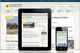
Forget mobile, go responsive?
I recently attended DrupalCamp Austin and went to several sessions on mobile. It was a little funny how they contradicted each other. One session would talk about how mobile is the way to go then another session would talk about going responsive. I've been on the fence on which I think is the right approach. I've done lots of mobile sites, but I hadn't jumped into the responsive world yet. So for a recent project, I decided to give it a try.
First off, what do I mean?
By mobile, I'm talking about creating a site with a different HTML/CSS markup but serving the same content. When I do mobile, I generally use a tool to determine if the user is on a mobile device and then I serve the different content designed for the mobile device.