Design

Apple's Magic Mouse is an example of easy scrolling

Stop talking about the fold.

Posted by JD Collier on February 03, 2012

I have been as guilty as anyone in talking about the fold — the invisible (shall I push and say "imaginary"?) line where scrolling begins. I even think about the fold when I design a web site. Why am I thinking of a concept that came from the newspaper industry? Perhaps I spent too much time on my school's newspaper staff! 

READ MORE
Great content is wasted if there is no focus!

Great content is wasted if there is no focus!

Posted by JD Collier on January 06, 2012

You have a message to share, a product to sell, a service to offer — but it may be all for nothing if your website doesn't have focus. When we design a website, we are always looking to focus our client's message so that the message can be heard over the "noise" of our culture.

READ MORE

What are you looking at? Eye Tracking can help your content be more effective.

Posted by JD Collier on December 30, 2011

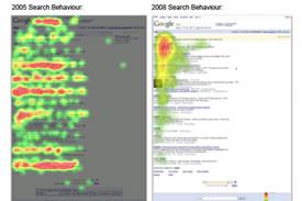
My favorite type of data in the world of user interface design/user experience is Eye Tracking. An Eye Tracking study tells us where people look. It can tell us the order that information is scanned and it can display a heat map to show where a sample of web visitors looked on your web page. Eye Tracking can be used for web content, print media, product packaging and anything else where you want to measure what is being seen.

The image to the right shows the difference in search behavior from 2005 to 2008. The data shows that people have learned to scan Google and not read every item.

READ MORE

Tear down that wall of words!

Posted by JD Collier on December 16, 2011

Often I have a client who needs a lot of words on the page. At first glance, I feel like I can condense the message — but just as often, the nature of my client's industry requires specific language. Good design and marketing practices tell me to have a short page to read, but when I try to edit the page, there isn't much content I can trim (especially when there are product features or legally-required points to cover).

READ MORE
Responsive design

Forget mobile, go responsive?

Posted by JD Collier on December 02, 2011

I recently attended DrupalCamp Austin and went to several sessions on mobile. It was a little funny how they contradicted each other. One session would talk about how mobile is the way to go then another session would talk about going responsive. I've been on the fence on which I think is the right approach. I've done lots of mobile sites, but I hadn't jumped into the responsive world yet. So for a recent project, I decided to give it a try.

First off, what do I mean?

By mobile, I'm talking about creating a site with a different HTML/CSS markup but serving the same content. When I do mobile, I generally use a tool to determine if the user is on a mobile device and then I serve the different content designed for the mobile device.

READ MORE

San Antonio Web Design

Posted by AMac on September 29, 2011

A few months ago, I came up with an idea to design and build a Digett landing page that would break down the state of the San Antonio web design community and explain to the average consumer why the Digett way is the only way to go. Today, I'm proud to announce the launch of that page — San Antonio Web Design.

READ MORE

Web Design: The Anatomy of a Footer

Posted by AMac on September 20, 2011

Last week I wrote about the anatomy of a header, an important piece to the website puzzle. This week, I want to scroll down to the bottom of the page and take a look at what makes up a footer.

READ MORE
Subscribe to Design