

Fonts: Making or Breaking Mobile Design
Take a few steps into a crowded room, a park, or a street. At least someone will have a mobile phone or some equivalent that they are using to surf the web in some form or fashion. So the next time you sit to plan a website, you may just want to consider what kind of impact those fonts can have on that carefully crafted webpage.
Screens and screens and screens
Not convinced that the mobile market is worth talking to?
Let’s play a game. Start by naming as many mobile devices as you possibly can! Here are a few: iPhone. iPad. Blackberry. Nexus. Galaxy. MS Surface. Lumia. etc. etc.
Now imagine how many people use these devices.
Parents. Managers. Employees. Students. Customers.
That is a lot of people. And that number of people just keeps growing and growing. You would not want to miss potential customers because you had overlapping text that made your site unreadable, now would you?
What's so different compared to desktop browsers?
The biggest difference is that, compared to desktop or even laptop computers, screen space is a commodity in short supply. This, combined with the inherent portability smartphones and tablets bring with the table, leads to a browser experience that is more optimized for bite-sized, on-the-go presentation of information.
What does mean for presentation? All of a sudden, flashy animations take a back seat to the importance of the content, which is most often represented in the form of text. It is all the more important to make that text stand out as much as possible, and while there are plenty of techniques, fonts are the most basic way to make that happen.
What makes a good font?
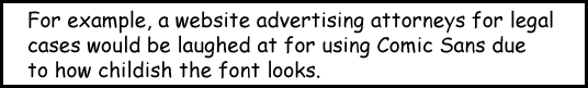
Like tools, all fonts have different moods and uses, so a font should be representative of what it is trying to represent.
The difference between serif and sans-serif is not as large due to the increased resolution on newer devices, but sans-serif is slightly more readable on older devices.
Just a few small tips:
- Less commonly supported fonts should include CSS’s @font-face rule for safety in case the font does not exist
- Browsers use different typefaces for your chosen font, so for maximum support, be wary not to confuse OpenType (OTF), TrueType (TTF), and Scalable Vector Graphics (SVG) file types together.
If a problem related to fonts refuses to be solved, I find that messing around with the above helps a lot!
Just remember: fonts are to be loved, not ignored. Have some fun with them!
Related links
MONTHLY MARKETING INSIGHTS.
Get thought-provoking and actionable insights to improve how your firm makes a connection with your customers.


LEAVE A COMMENT