

Sandbox Module: BarTables
Nearly 20 years ago Dave Raggett produced a document outlining proposed features for HTML+ which included one of the first ever references to tables. Since that time, tables have been used for both the display of data and controlling the layout of pages.
Data tables
Thankfully, we have largely stopped using tables for layout and they only present themselves when there is a need to display tabular data. These data tables tend to be designed for desktop presentation and do not display well on mobile devices.
In many cases, data tables contain multiple rows and columns of data. While there are a variety of solutions available to help with the display of data tables on mobile, many of these focus on collapsing or hiding columns — which may not always work with the data at hand.
BarTables
We encountered this problem with a recent project where the data would work well displayed in multiple columns or multiple rows, but the desktop and mobile displays needed to be different — the desktop display called for this data to be shown in multiple columns and the mobile display could accomodate the data in multiple rows without losing context.
Our solution, now a sandbox module called BarTables, utilizes jQuery to re-write table structures switching rows and columns of a table on mobile devices.
Examples
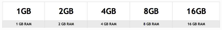
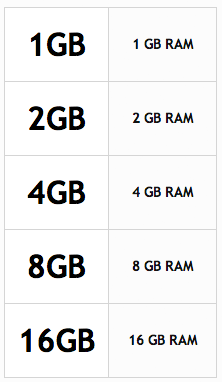
In our example, we have a table which contains one row of data for each column. On mobile, we want this to be shown as two columns with multiple rows.
Desktop Table:
Mobile Table:
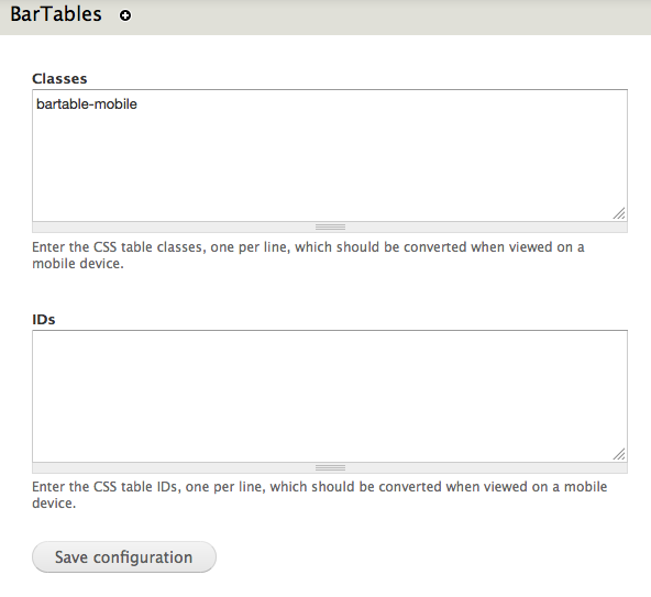
To make this work, we configure a CSS class or ID for the table at admin/config/content/bartables and put that same class or ID on the table. We have intentionally tried to make this as easy as possible for the average non-technical user.
BarTables Configuration Screen:
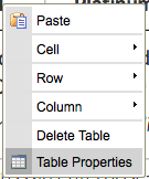
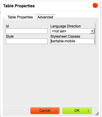
To add the class to the table from within WYSIWYG, right-click on the table and select Table Properties. Under the advanced tab, enter the CSS ID or class that you entered on the module configuration page.
What's next?
At present the module is quite simple, and needs some additional work to help maintain table styling and some more sophisticated layout options. These would include rowspan and colspan attributes and likely integrating with the footables module.
Do you have any suggestions or recommendations for module features? Are there alternatives that may work better? Let us know in the comments.
Resources
MONTHLY MARKETING INSIGHTS.
Get thought-provoking and actionable insights to improve how your firm makes a connection with your customers.

LEAVE A COMMENT
Have a look at the Responsive Tables module: https://drupal.org/project/responsive_tables
The Responsive Tables module appears to have the same deficiency that most solutions have in that it simply hides the columns. While this may work with some scenarios, there are many others where this is just not an acceptable option.
How does it work with multiple table rows?
@Mark
Multiple table rows will be converted to multiple columns. This is where the integration with the fooTable module, or one of the many other options, will come in hand.
Alternatively you could use non-table markup with a grid system like susy to accomplish the same behavior without JavaScript
@dasjo
Using a grid system would eliminate the table, however, it would also make it difficult for a non-technical user to manage. Tables have a purpose and we should use them for their intended purpose.