
The Year of the Logo
"Brand yourself and toot your own horn," says the Donald Trump doll. The Donald makes a good point, as usual. Every business should have a strong brand that stands out among the competition.
A good logo is the foundation of any brand. Any effort to brand or re-brand a business should start with a good logo—one that is unique, easy to identify, and representative of the company for which it stands.
Perfecting a logo is arguably the most important step of the branding process, because it is essential to all other promotional materials, including a website.
I bring this up because of all the projects I've done this year, logo designs have been among my favorite, three in particular. Let's take a look back at each project and I'll share a few techniques I've learned and used to create strong logos on which to build strong brands.
Fiddlin' Frogs
Recently, I wrote a blog post about the re-branding of Fiddlin' Frogs that outlined an opportunity I had to create a new logo for a flourishing boutique specializing in trendy, wearable clothing, unique furniture, and a variety of other merchandise.
For this task I used a technique I think was particularly effective for this type of business, a relatively small storefront with a large variety of merchandise and a long list of competitors. I'll call this technique, "What?"
The idea is to have the client answer some abstract questions about their business in comparison to a direct competitor. Here is an example from the Fiddlin' Frogs survey:
![]() "Neimen-Marcus is a Rolls Royce. If your business was a car, what kind of car would it be?"
"Neimen-Marcus is a Rolls Royce. If your business was a car, what kind of car would it be?"
Fiddlin' Frogs answered a white Range Rover. This answer revealed some insights into their business that may have otherwise been overlooked and laid the groundwork for a logo design that fit just right: luxurious sophistication with a distinct adventurous attitude.
Flying Circle Bags
Flying Circle Bags came to us with a need to overhaul their aging website. An early conversation about the brand revealed a concern that their logo too closely resembled that of the Mini Cooper. To be confused with another company is exactly the opposite of what branding is meant to do. A new logo was on order.
The technique doesn't really have a name, although some might call it "Common Sense."
For a well established company like Flying Circle Bags, with a rich history and a story to tell, learn everything there is to know about the company's history, who started it, where, when, why, and how. The past might just reveal a gem to hold onto in the future.
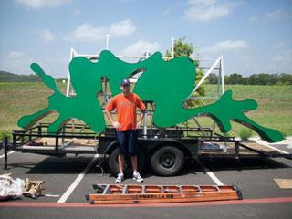
The client told us about all the changes the logo had undergone over the years and how it originated from an old cattle brand, a picture of which they sketched on a small piece of paper. ![]() This picture stuck in my mind and later inspired the idea for the new logo design.
This picture stuck in my mind and later inspired the idea for the new logo design.
A logo backed by a great story can do wonders to attract new customers and retain loyal customers who all want to be a part of that story.
Boerne Today
What of a company with no history at all, a new business just getting off the ground? This opportunity presented itself in the form of Boerne Today, a new online community for all things Boerne, Texas.
New businesses are in dire need of great logos, because with no foothold in the existing market, all customers have to rely on and remember is the name of the company and the logo.
I used a technique for this project that I'll call the "The Grid or The Table" or "The Matrix." Here is how it works.
Draw a grid on a sheet of paper with five or six rows and columns. Across the top, label each column with a keyword that relates to the name of company. One of my keywords here was "Boerne," as you might expect.
Down the right side, label each row with a keyword that relates to what the company does, a product, or service it provides, or where it is. One of my keywords here was "hill country."
![]() Now, where each row and column intersects is a unique box to conceptualize a logo using only the two keywords that cross. It was the box made by "Boerne" and "hill country" that lead to the discovery of what is now the Boerne Today logo.
Now, where each row and column intersects is a unique box to conceptualize a logo using only the two keywords that cross. It was the box made by "Boerne" and "hill country" that lead to the discovery of what is now the Boerne Today logo.
Looking Back
These are just a few techniques I've used to design logos, and I'm sure there are 100 more ways to do the same thing. What's important is the final product. Each of these logos serves as a strong cornerstone on which to build the brand, and I'm proud to have been a part of each of them.
![]()
MONTHLY MARKETING INSIGHTS.
Get thought-provoking and actionable insights to improve how your firm makes a connection with your customers.
LEAVE A COMMENT