
Elements of a successful newsletter
All of us get newsletters. I'm signed up for everything from my neighborhood news to web programming. The majority of these get less than a 10 second glance before I delete or trash them; but there are one or two I look forward to receiving and read everything they write. What makes these different?
Content is king!
The most important criteria for me (your customer) reading your newsletter is relevance. I am not going to read a newsletter about electrical engineering because it doesn't fit my interest profile.
There are two reasons I read your content:
- Need - I read the newsletter for my neighborhood because it has information I need.
- Want - I read a newsletter about web design because I want the information.
Both scenarios score high enough in relevance to me that I am willing to give a few minutes to the content.
Authenticity
After relevance, authenticity is vital. Authenticity may have become a buzz-word, but for good cause. If I have the slightest twinge that the newsletter is using marketing techniques disingenuously, my brain starts to tune out. People aren't stupid. We recognize marketing.
To clarify though, just because I sense marketing techniques in a message, I don't immediately tune you out. I understand and appreciate that your business is working to stay in business. So am I. If, however, the marketing techniques feel to me like you aren't helping me while I'm helping you, it feels like a bad relationship. I'm giving time and sometimes money and not getting a return on that investment.
Give me something
An added bonus of my favorite newsletter is that they almost always include free downloads of things I want. Free downloads are great … if I want the item. In my case, they are things like free fonts or photoshop textures.
The trick here is to offer things that the audience wants. This can be a challenge, but it is a wonderful bonus when it is there. I think it is one of the key reasons why my favorite newsletter is my favorite.
Layout
It doesn't have to be pretty, but it does need to be well organized. My favorite newsletter has the same header every time and then a series of articles; I always appreciate that there is a title and a four line teaser for each article. They also place a great image next to each article. I am a visual person and my favorite newsletter always has images that draw me in. Whether it is a silly image to illustrate a point or a specifically drawn image to quickly explain a concept, I appreciate it.
Clean, clear, quickly scanned … these are the rules that make me read on.
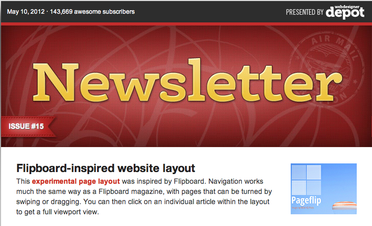
My favorite newsletter is from the Webdesigner Depot. Here is an example of the last newsletter I received.
Related Articles
- Beyond "clean & user-friendly": websites with a better purpose
- Is your site a mess or a fine-tuned machine? How to organize your website
- Great content is wasted if there is no focus!
Image credit: Webdesigner Depot Enews Header
MONTHLY MARKETING INSIGHTS.
Get thought-provoking and actionable insights to improve how your firm makes a connection with your customers.
LEAVE A COMMENT
Thanks! This is quite helpful.
Glad to hear it, Noa!