
Rebranding: The Good, The Bad and The Ugly
Today companies are making sure they keep their brands up-to-date and fresh. Many ask why they want to change their current brand, brand essence, logo, packaging, etc. There are several factors that are considerable when thinking about changing a brand identity.
For example, the brand may be outdated, the strategy and communication has changed or their brand and products are being overlooked. Companies are always looking for new ways to market themselves, challenge their competitors and come out on top. Rebranding should always focus on the company’s communication to their target market.
You can re-design logo, brand identity, packaging and/or essence
Redesigning can be an extensive process in trying to figure out how to relate to the current culture, but also stay true to what your brand is and overall what your main communication is to the consumer.
First step, like every design process, should be research. Understanding the company’s goals and positioning can really help guide the designer to approach rebranding in a specific way.
Second would be to create a Creative Brief. A Creative Brief includes a background of the company and their products or services, a mission statement, specify who the target market is, who the competitors are, and the style and tone that will be communicated. Most importantly it also includes the reasons for the redesign and how this will improve the company's brand identity. Here’s some good information on mastering the creative brief.
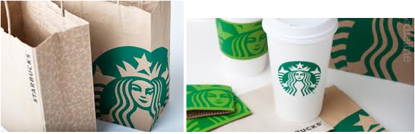
Third, start designing new concepts. The concept should remain the same and build graphic vocabulary throughout all designs and mediums. The brand logo should be cohesive with the packaging, tagline, interior design, website, stationary system, etc. This creates a brand essence and keep consumers connected with the overall communication.
Starbucks rebranding
In 2011, Starbucks decided to rebrand their identity by updating the logo to fit their company’s needs. As a consumer, I think redesigning Starbucks logo by taking out the type “Starbucks Coffee” helped improve the overall image. They kept the same branded colors, as well as their circular shape to contain the logo.
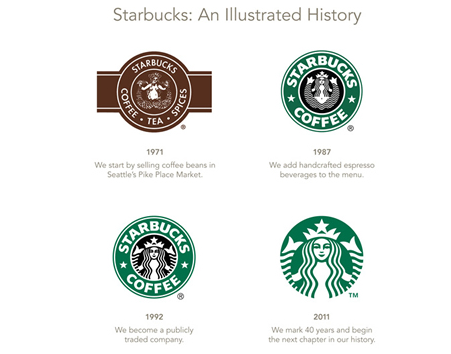
Today, since Starbucks is so well known the design seemed old, with its bold heavy text making the composition compact. The black color did not help add to the design, instead only giving the image contrast since the female is intricate. Consumers did not see black as a branded color for Starbucks. Discarding the black helped simplify and clearly communicate their brand.
The simplified version of the logo really helps focus on the embellishments of the woman, which fits with their brand essence and target market; most consumers who purchase Starbucks are men and women aged 25 to 40 who “tend to be urbanites with relatively high income and have professional careers,” says Renee O’Farrell. Starbucks’ rebrand is a great example of how the brand identity remains cohesive throughout its packaging and essence.
Be careful! rebranding can gain negative responses
Although many companies have been successful in rebranding, there are several companies who have failed in re-creating a brand image that represented the company as well as its consumers.
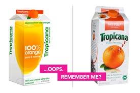
Let’s look at Tropicana, a large company who has struggled to maintain their image.
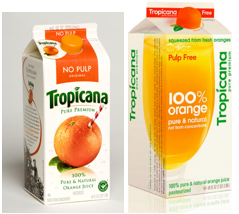
(The carton on the left is the old Tropicana packaging and to the right is the redesign by the Arnell Group.)
Many consumers were unhappy with the new redesign, and many stopped purchasing Tropicana when Tropicana changed their packaging. According to AdAge, Tropicana’s unit sales decreased by 20% in less than two months of their package being displayed on shelves.
After two months of sales decline, Tropicana announced that they were dumping the new redesign and switching back to the old design. Watch CEO Peter Arnell Defend Tropicana's Redesign.
Why Tropicana failed
In the old packaging Tropicana focused on three main pieces of information: Tropicana, No Pulp, and Pure and Natural Orange Juice. The old packaging helps consumers easily find the product that best suits them by using a large colored band at the top.
The hierarchy seems to be unclear in the new redesign; the composition and size of the text does not help the customer easily find the important information that helps them decide which container to select. The main focus on the redesign is “100% Orange,” and the thin label at the top of the box makes the package less user friendly.
Although the typography looks more modern on the redesign, it does not relate to what Tropicana sells. The old packaging uses typography to its advantage by creating a typeface that has nice curves and is smooth, resembling the product. They use a serif small caps typeface that creates an elegant and professional feel. These variations of typeface and size are consistent throughout the design.
Tropicana has always used the orange with a straw as their imagery. The redesign completely dismisses this and chose to display what is inside the orange — its juice, which they are selling. The imagery is not cohesive with the text that reads “100% Orange Juice” because many consumer prefer to see the real orange reiterating that it is natural.
Even the brighter colors on the redesign do not help create that “natural” feel to the consumers. The old package uses more rich, bold colors that help remind the consumer of nature.
Don’t be scared to rebrand your company
Companies should decide to rebrand not just to “update” their brand, but also to make it better. They should look at the positive aspects of how the consumer relates to their current brand and the negatives. Then they should improve on the negatives instead of changing the brand image completely like Tropicana chose to.
More on rebranding
MONTHLY MARKETING INSIGHTS.
Get thought-provoking and actionable insights to improve how your firm makes a connection with your customers.


LEAVE A COMMENT