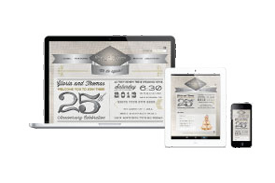
Why You Should Make Your Content Look Great on All Devices
Today, responsive web design is a way for developers to create smooth transitions between various viewport sizes using media queries. The media queries tell the browser, if a person is viewing from 320px width device, look like this (a condensed version of the desktop version to fit a mobile phone).