A Developer's Perspective on Mobile Websites, part 2
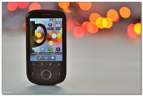
Last week, I talked about A Developer's Perspective on Mobile Websites. This week, I'd like to take that a bit further and discuss special considerations for mobile development.

Last week, I talked about A Developer's Perspective on Mobile Websites. This week, I'd like to take that a bit further and discuss special considerations for mobile development.
Andrew posted an article on Mobile Website Design this week. In it, he talks about a designer's perspective on the mobile audience. From a development perspective, mobile website development is a breath of fresh air. As I began writing, I realized I touched on a topic of interest to me, and I hope you. I'm planning to break this up with a different piece of this mobile topic each week for several weeks.
Over the past several months, I've had the opportunity to design a few mobile sites, and from a designer's perspective, they're a lot of fun. What I find engaging are the design challenges that come with optimizing a full-size website for a small screen.
Last year, we talked about using the Mobile Tools module to create mobile sites in Drupal. We use and appreciate Mobile Tools, but we recently had a requirement that made us look into other options. We needed one domain to serve two different mobile sites.
In part one of Giving Your Content Wings we asked the question, “Is my content findable?” In today’s installment we’ll be discussing accessibility — a broad category that covers everything from your site’s design to your contents’ reading level.
Do you wish that you could track the success of your offline marketing engagements to the same degree as those online? Leveraging your mobile marketing using QR codes might be the solution to your problem.
Everyone has heard the old adage, “The world’s oldest profession. ” But it usually isn’t associated with art or technology.
We have at last arrived at the final installment of The Ugly, The Bad, and The Good of mobile website design. We left off last time reviewing some technical hurdles and background of basic Mobile UI concepts. In this article we’ll be discussing all the good things that make a mobile website perform well while providing a professional presence for your business to mobile users.
Last week we started our series on mobile website interface design with The Ugly. We’re working our way up to The Good, but we have to address The Bad first. Hopefully this will help to provide a basic roadmap for ensuring your mobile website falls into The Good category.
If your answer to the question, "Is your website ready for mobile?" is "No," you've joined us at the perfect time. Over the next several weeks we'll be digging deeper to expose some mobile website design best practices that will serve as a guide for your venture into the world of mobile website and Graphical User Interface (GUI) design. We'll get to the Good soon enough, but first we need to start with the Ugly.